Data explorer
ServicePilot provides access to the data it collects as graphs, tables and summaries as well as the raw data as stored in its databases. All of this is filtered and categorized to produce useful statistics.
When deploying resources, the package templates come with pre-defined dashboards to display information related to these resources. These dashboards might already show the information you require but it is possible to refine these searches or create completely new queries.
Data types
There are two main data types for information stored by ServicePilot in its databases. String fields store text. Integer fields store numerical data.
Indicator thresholds
When testing thresholds, String indicators can only use the = and <> operators while Integer indicators can also be checked using < and > to see if the value is greater or less than a limit.
As well as fixed thresholds, Integer indicators can also have thresholds set against analytical analysis of the data series. If machine learning spikes or cluster alerts are detected, these can also set indicator status. More information about Data Anomalies can be found under What is a threshold?
Database Query operators
When extracting data from the ServicePilot database, a number of series of data are collected to be presented. Each series is collected within the same time period specified. Either a Field is specified and a Field Statistic operator or a Formula is applied to the data.
Field statistics
Field Statistics are limited by the type of data being queried.
| Data Type | Field Statistic | Use |
|---|---|---|
| String & Integer | Count | Count the number of records in the database that contain this field within the time period specified. Not all records in the database contain all of the fields. If a count of all records is needed, count with the id index field that is present in all records. |
| First value | Obtain the first value of the field selected within the time period specified. | |
| Last value | Obtain the last value of the field selected within the time period specified. | |
| Missing data | Count the number of records in the database that do not contain this field within the time period specified. | |
| Unique | Count the number of different values that the field selected takes within the time period specified. | |
| Integer only | Sum | Sum all of the values for the field specified within the time period specified. |
| Mean | Find the average for all of the values of the field specified within the time period specified. | |
| Min | Find the smallest value from all of the values of the field specified within the time period specified. | |
| Max | Find the largest value from all of the values of the field specified within the time period specified. | |
| Sum2 | The squared sum all of the values for the field specified within the time period specified. | |
| Percentile | An estimated value for the specified percentile from all of the values for the field specified within the time period specified. For example: The 20th percentile is the value below which 20% of the observations may be found. | |
| Spike | Count the number of values that start falling outside a dynamically calculated range around the plot of values from the field specified. | |
| Trend1 | A sliding trend expressed in as a percentage for the field specified. | |
| Trend30 | A sliding trend over 30 days expressed in as a percentage for the field specified.. | |
| Prediction | A time forecast as to when this field will cross the critical threshold associated with this indicator. |
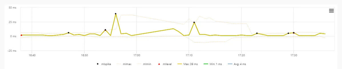
The more complicated statistical formula are best represented graphically using an example graph. This graph plots one indicator with associated range and spikes outside the range.
Formulas
Rather than obtaining a statistic directly from the data, a Formula can be applied to create a new series from the existing series. For example: A series is defined obtaining the sum of inbound network traffic and a second series is defined, obtaining the sum of outbound traffic. A third series is then defined as the sum of the first two series so that total traffic can be viewed.
| Formula | Use |
|---|---|
| sum(x,y,...) | Add the series values together. Example: sum(series0,series1) |
| sub(x,y) | Subtract the second series from the first. Example: sub(series0,series1) |
| product(x,y,...) | Multiply the series values together. Example: product(series0,series1) |
| div(x,y) | Divide the first series by the second. Example: div(series0,series1) |
| termfreq(series#,term) | Count the number of times term is found in the series. Example: termfreq(series0,'ok') |
| viewpath(series#) | Obtain the view hierarchy for the series. Example: viewpath(series0) |
| status(series#) | Obtain the status of the series. Example: status(series0) |
Custom database queries
As well as widgets querying the ServicePilot database in dashboards and PDF reports ad-hoc queries can be run from the Data explorer menu. These queries can be refined to create new widgets if needed. The data returned will always be filtered automatically based what a particular user is allowed to monitor.
There are two ways in which queries can be made.
- Widget - Lucene syntax
- Query - Simple SQL syntax
Lucene queries use the Apache Lucene query syntax. Data can then be presented in many forms. The query and the presentation form together are represented as widget definitions.
Simple SQL queries extract a single series of data based on a database with a selection criteria, a grouping operator and a filter. The data is presented in the form of a table that can be exported in CSV format.
Perform an SQL query
To perform a simple SQL query in one of the ServicePilot databases go to the Data explorer page.
| 1. Open the SQL page | |
| 2. Change the time span to the smallest time period to reduce query times while developing a new custom query | |
| 3. Go to the Examples page | |
| 4. Set the SELECT, FROM and GROUP BY fields as well as an optional WHERE | |
| 5. Add a query filter and click on Apply | |
Custom searches can be saved with the Save button. These can then be retrieved and deleted in the Saved queries section of the example queries.
When a group of data is selected in the presented response, it is possible to Copy the result or to Export it in a csv format.
Perform a Lucene query
To perform Lucene queries, use the Widget page to define both your query and data presentation in the form of a widget. See the Create custom widgets section below.
Create custom widgets
If the existing dashboards do not present the data in the form you want, new custom widget can be created and stored for use in custom dashboards and PDF reports. See the Dashboards page for more details.
Select widget source data
| 1. Start by opening the Widget page | |
| 2. Change the time span to the smallest time period to reduce query times while developing a new custom query | |
| 3. Select one of the available Examples as a starting point, based on the data to be queried. Templates are organised by the database in which the data is stored. Existing custom searches are presented at the bottom of the list under Display. | |
| 4. Select the Display menu |  |
| 5. Click on the Documents view button to see the raw data as it is found in the database |  |
| 6. View all available fields for a record by clicking on the table icon at the beginning of the line | |
| 7. To change the way in which the events are presented, click on the Properties button and select which data to show and highlight in the table as well as toggling the graph visibility |  |
It is possible to present this data directly as a table of records, however it is almost always more useful to filter, summarize, sort and graph the data.
Define widget data series
Series can be added, modified and deleted from the Series list above the widget.

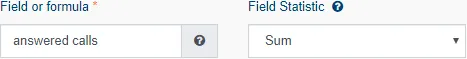
A number of different series might be defined and displayed in the same widget. Each series has three critical parameters; Field or formula, Field Statistic and Title.
Other series parameters depend on these initial settings. Note the Table and Heat map tabs in the Series Settings Dialog contain further settings for how this series data will be presented.
Widget data presentation
Once the data is selected and filtered, it can be presented in many different ways. Use the Display menu to select how the data is to be visualized.
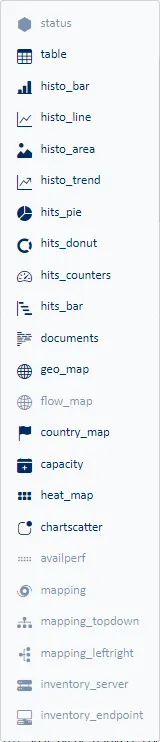
| View Type | Use |
|---|---|
| Table | Display each series as a column in the table. The rows in the table are defined by the Group by filter. |
| Histo_bar | Display of a bar chart over time. The series are stacked on top of each other. |
| Histo_line | Display of a line per series and stacking them in a graph over time. |
| Histo_area | Similar to the Bar Chart, the Area Chart displays stacked series over time, except in the case of zone charts. |
| Histo_trend | Display trend lines for each series over time. |
| Hits_pie | Display a pie chart in which each slice represents the value of a series. The size of each slice will be a relative percentage of all values in the series. |
| Hits_donut | Display a pie chart in which each slice represents the value of a series. The size of each slice will be a relative percentage of all values in the series. |
| Hits_Counters | Display a single value for each series from all data in the specified time interval. |
| Hits_bar | Display a graph of the series data. Each series will produce a vertical bar on the graph. |
| Documents | Display of the raw list of records in the database, one per line. A bar chart of the data can also be included. |
| Geo Map | Display of a map with geolocated pins grouping together the records for each IP address. |
| Flow Map | Display of a map with geolocated pins grouping together the records for each IP address. |
| Country Map | Display of a map grouping records by country based on IP addresses. |
| Capacity | Display trend changes in a series in a table with an indication of when an item is expected to cross the critical threshold, if defined. |
| Heat map | Display of the values of a series over time in the form of a number of colored squares, with the shade of the square representing the value. |
| Chartscatter | Scatter plot comparing one series to another series. Each point on the graph is defined by the Group by filter. |
| AvailPerf | Display of the availability and performance of views or objects over time. The rows in the table are defined by the Group by filter. |
| Mapping | Display of a map linking different elements. Values are presented for each series in a relationship between two elements. Each series will produce a graph according to the selected graph type. |
Manage widget buttons
Widgets templates may be copied, cloned, edited, saved and deleted using buttons at the top right of the Widget page. Once saved, custom widgets can then be used to build dashboards and PDF report templates.

| View Type | Use |
|---|---|
| Stats info | Tables of information relating to the sources of data, data resolution and presentation methods available relating to data sources. |
| Copy | Copy the current widget definition to your clipboard as a JSON widget definition. This can be pasted into a dashboard or PDF report template of into the JSON widget editor accessible via the JSON button. |
| JSON | Open the JSON widget definition editor. The widget may be edited as text in this dialog. When OK is pressed, the Widget web page will update to reflect changes made to the widget definition. |
| Delete | If a custom widget template was selected, this template may be deleted from the list with this button. |
| Save | Once a new widget has been developed and tested, it can be given a name to save it to the custom widget list. Selecting an existing name will overrite a custom widget template or providing a new name will create a new template. Custom widget names can be selected when editing dashboards and PDF report templates. Note that when a widget is imported into a dashboard or PDF report template, a copy of the definition is taken. This means there is no link between the custom widget definition and the dashboard or PDF report template into which it was included. |
